case study [03]
Building a Strong Foundation: Designing Shopl's Landing Page to Drive User Discovery and Interaction
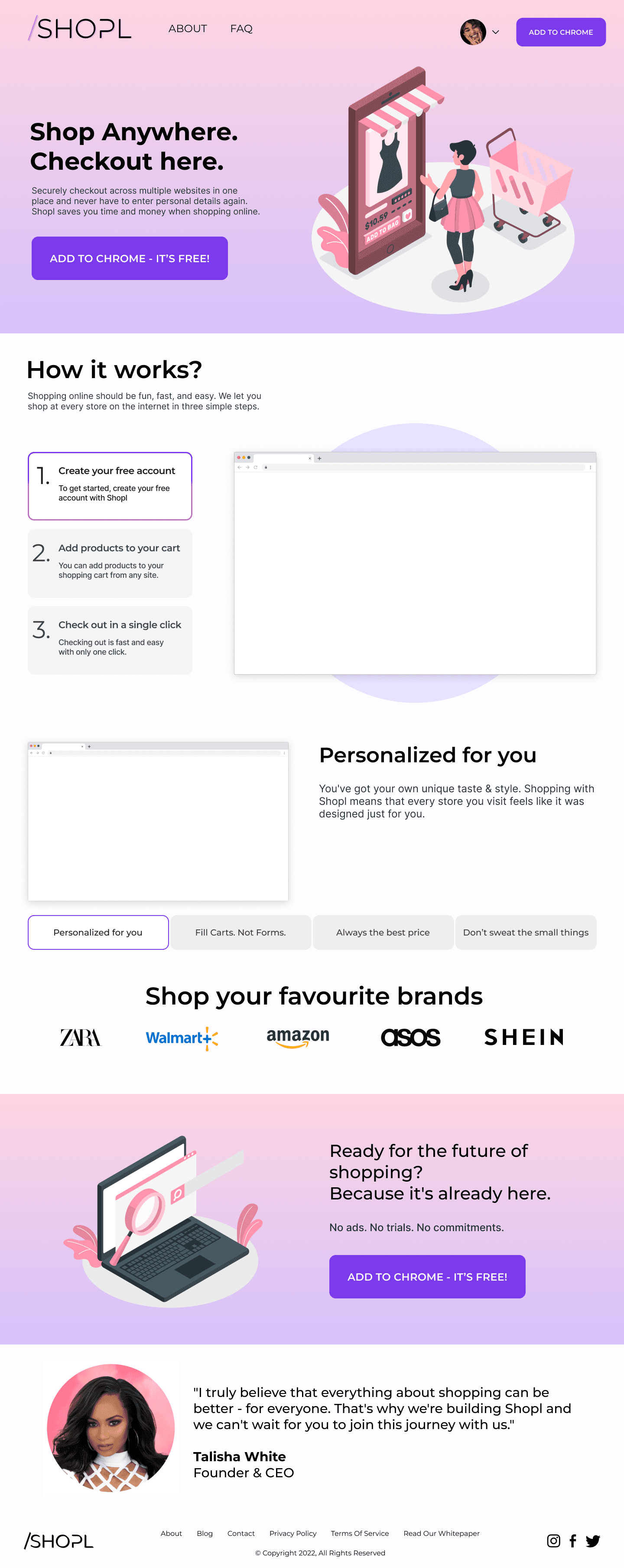
Endless tabs, missed discounts, and a cluttered shopping experience—frustrating, right? Super shoppers need a seamless way to browse, save, and buy, but too many steps can create friction.
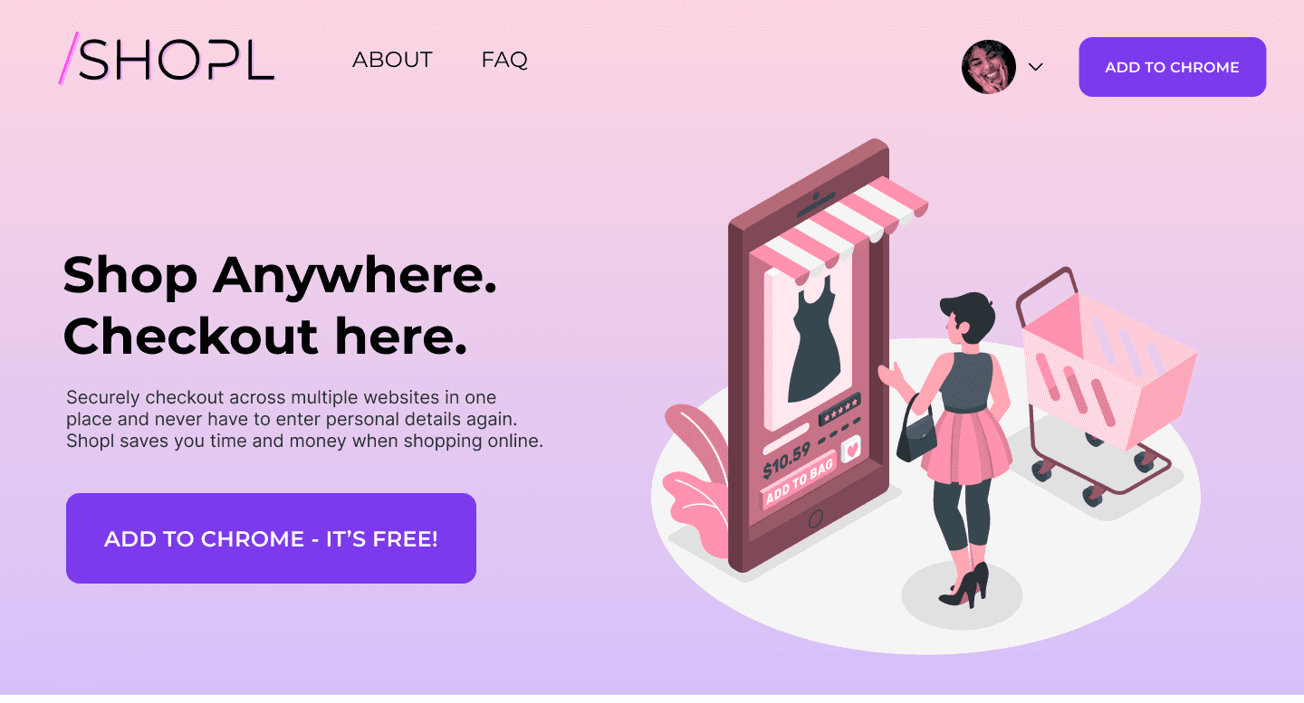
Shopl needed a landing page that captured attention and drove downloads. I redesigned it to simplify messaging, highlight key features, and build trust, creating a smooth, intuitive experience that encouraged users to install the extension.
Year
2022
Project Type
eCommerce
Duration
4 Weeks
Role
Product Designer
Problem
Shopl, a Chrome extension aimed at frequent online shoppers, faced several challenges with their landing page. Key issues included:
Lack of Clear Messaging: The landing page didn’t clearly convey the value of Shopl’s features to "super shoppers".
Low Conversion Rate: Despite offering helpful features, the page wasn’t compelling enough to encourage users to download the extension.
Engagement Issues: The design failed to resonate with the target audience, resulting in poor user engagement and high bounce rates.
Solution
I redesigned Shopl’s landing page with the goal of increasing conversions by addressing key user concerns. The solution focused on:
Clear Messaging: Simplified the copy to clearly communicate the value proposition of Shopl, making it easy for users to understand the benefits of the extension.
Streamlined User Flow: Designed an intuitive layout with a clear call-to-action to encourage users to download the extension.
Trust-Building Elements: Added key information on security and user reviews to instill confidence in the product, addressing user concerns about privacy.
Modern and User-Friendly Design: Used a clean, minimalist design with visual hierarchy to make the page feel approachable and easy to navigate.
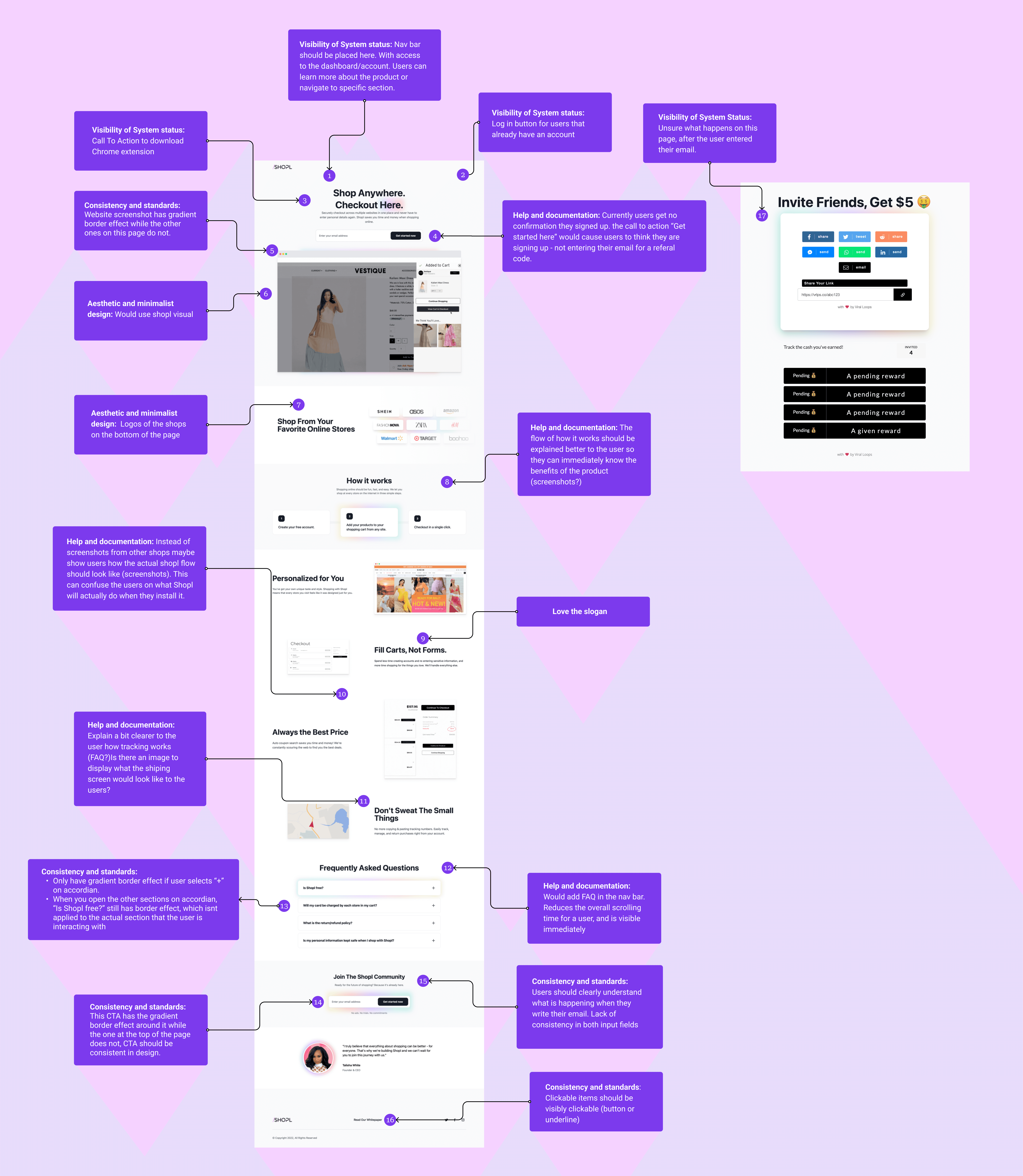
Discovery & Client Research
Before designing, I collaborated with my team to interview the client and understand their goals, target audience, and user feedback. We also analyzed competitor landing pages to identify best practices. The client wanted a minimalist design with a clear call-to-action that encouraged downloads while quickly conveying the app’s features and benefits. These insights guided my approach, ensuring the page stayed clean, focused, and user-friendly.
Sketching & Low-Fidelity Wireframes

Refining the Design Through User Testing
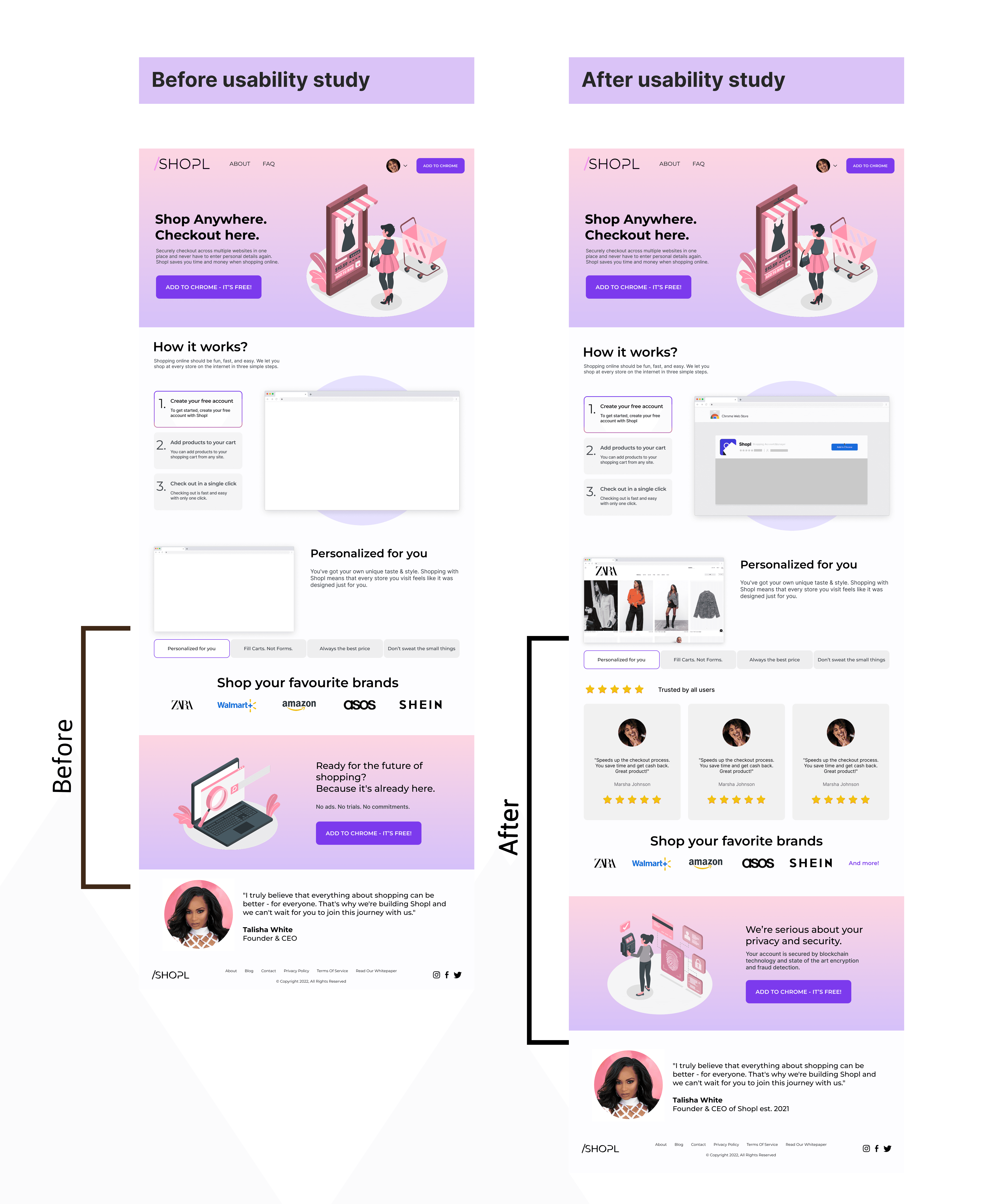
Based on user feedback, I made several changes to the body of the landing page to enhance trust and clarity:
Added customer reviews and ratings to build trust.
Added bottom banner to emphasize security, focusing on the blockchain technology used to protect user data.
Refined graphics to visually represent privacy and security features.